Logos and assets
The Checkpoint mark
Two squares joined by a route that turns once at a ring. Use the files below; never redraw the mark or retype the wordmark.
- Use the horizontal lockup (mark and wordmark) by default, the mark alone in square spaces, and the favicon form below 20 px.
- Approved colourings: ultramarine on
bgorsurface; periwinkle (accentdark) with light ink on dark; white on ultramarine; black; white. - Clear space is ⅜ of the mark height on every side.
- Trademark clearance has not been checked.
| File | Use |
|---|---|
logo-horizontal-color.svg |
Lockup on light backgrounds (this site's header) |
logo-horizontal-dark.svg |
Lockup on dark backgrounds |
logo-mark.svg |
Mark alone, light backgrounds |
logo-mark-dark.svg |
Mark alone, dark backgrounds |
favicon.svg |
Browser tabs and anything under 20 px |
apple-touch-icon.png |
iOS home screen (180 px) |
og-banner.png |
Social cards (1200 × 630) |






Product icons
Four icons on a 24 px grid, 1.75 stroke, mitred joins, butt ends, one colour: request, approval, agent and audit. Inline them as SVG so they take currentColor.
| File | Meaning |
|---|---|
icon-request.svg |
A request |
icon-approval.svg |
An approval |
icon-agent.svg |
The agent |
icon-audit.svg |
The audit log |


Right angles and 45° only; no curves except the checkpoint ring. No padlocks, shields, keys, clouds or circuit traces. No emoji.
Diagrams
The architecture illustration (light, dark) follows the diagram rules:
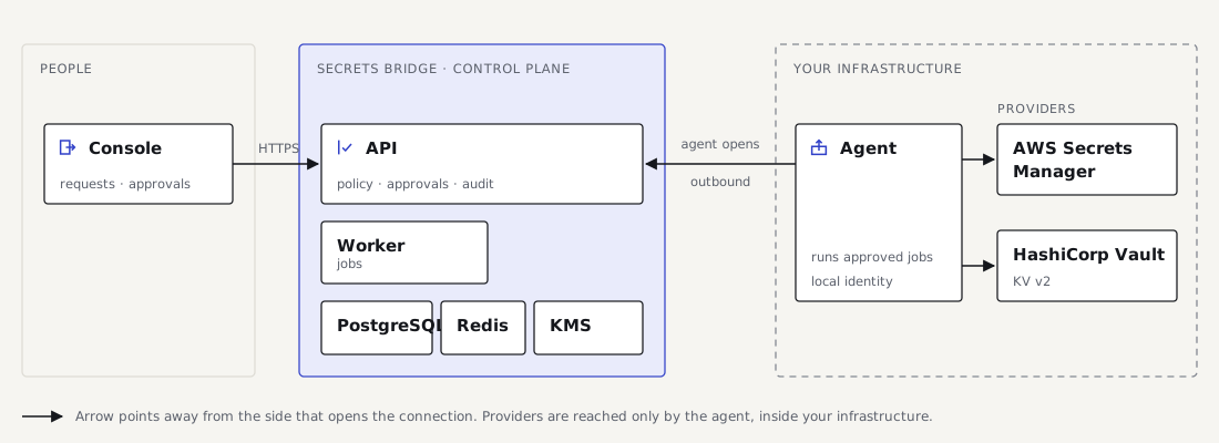
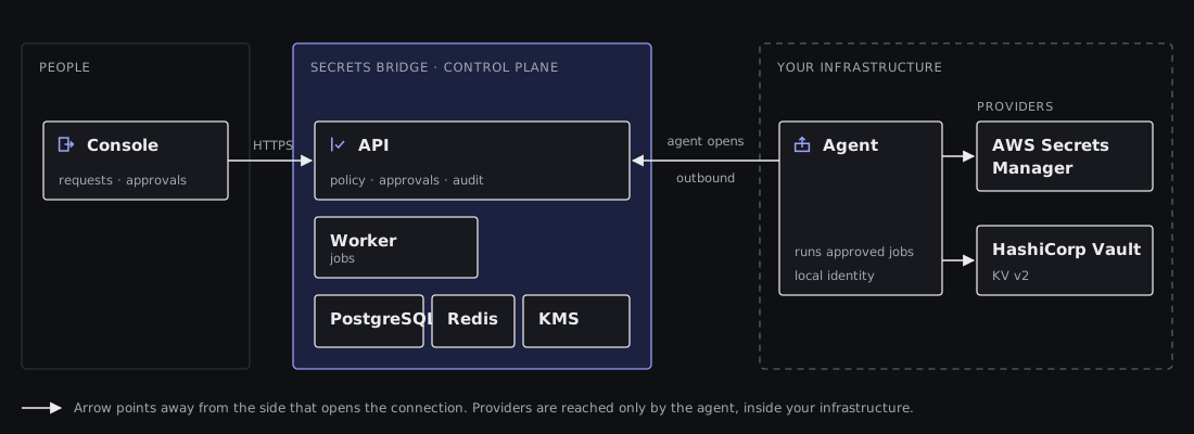
- Arrows point away from the side that opens the connection; solid opens, dashed returns.
- The control plane has an
accent-softfill with anaccentedge. Customer infrastructure has a dashededgeoutline. - Providers connect only to the agent. Never draw a line from a provider to a browser or the console. Name providers in text; don't draw their logos.
Documentation diagrams use Mermaid, not screenshots.